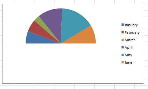
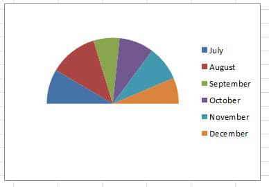
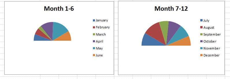
Sometimes you need to present data in a pie chart. And in this article, we will show you how to present your data in a half pie chart.
Suppose now you need to present the sales volume in a half pie chart.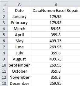
There are 12 months with the corresponding sales volume. And here you need to create two separate half pie charts for every half year. Below we will show you the steps to create the two half pie charts.
Arrange the Data
Before you create a half pie chart, you need to arrange the worksheet.
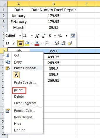
- Right click row 8 at the header area.
- And then choose the option “Insert” in the menu. Thus, you have inserted a row in the range.
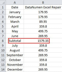
- Now input the content “Subtotal” into the cell A8.
- And then calculate the total sales volume of the months 1-6. You can use the SUM function to calculate the value.
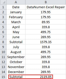
- Now input the “Subtotal” and the sum number into row 15 for the other half year.
Thus, you have arranged the worksheet.
Create a Half Pie Chart
In this part, you can follow the steps and create a half pie chart for your own data. Here we will create two separate charts for the worksheet.
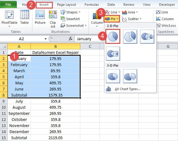
- Select the first range in the worksheet.
- And then click the tab “Insert” in the ribbon.
- Next click the button “Pie” in the toolbar.
- After that, click the option “Pie”. Thus, you have inserted a pie chart in the worksheet.
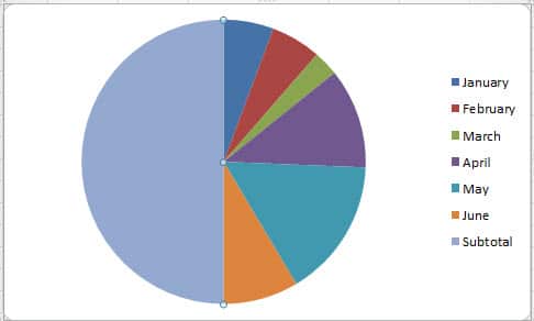
- Now click the area of the “Subtotal”. When you click, you will see that the whole pie is selected.
- And then click the “Subtotal” area again. Thus, only the area of the “Subtotal” are selected.
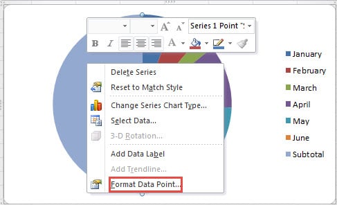
- Now right click the part of “Subtotal”.
- In the new menu, choose the option “Format Data Point”.
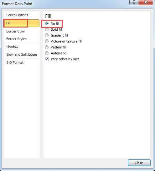
- In the “Format Data Point” window, choose the “Fill” on the right.
- And then choose the option “No fill” on the right.
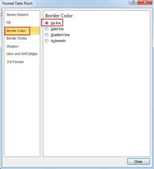
- Now continue click the option “Border Color”.
- Next click the option “No line” for the border color.
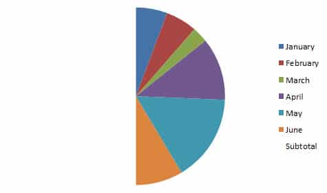
- When you finish the setting, close the dialog. In the chart, you can only see half pie.
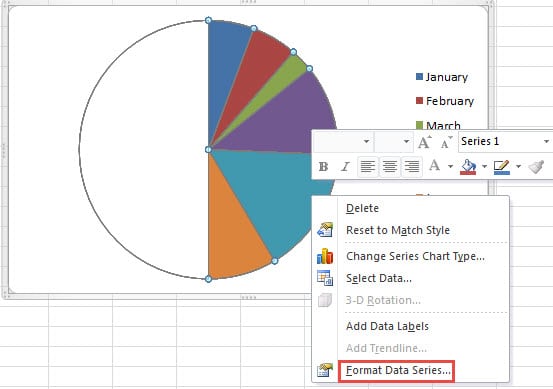
- Now right click the half pie chart.
- And then choose the option “Format Data Series” in the submenu.
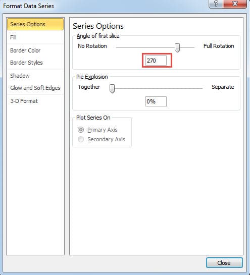
- In the “Series Options” window, change the rotation. Here we change the number into “270”. And you can also change it according to your need.
- Next close the window.
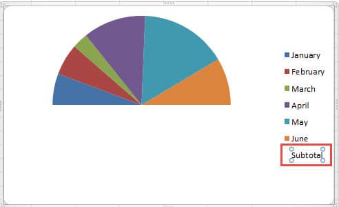
- Now delete the legend of “Subtotal”.
Therefore, you have created a half pie chart for the first half year.
- And then repeat the above steps and create another half pie chart for the second half year.
Insert Chart Titles
To make the charts more clear, you can insert chart titles for the two charts.
- Click one chart.
- And then click the tab “Layout” on the ribbon.
- After that, click the button “Chart Title” in the toolbar.
- In the drop-down menu, choose one option. Here we choose “Centered Overlay Title”.
- Now input the title in the chart area.
- And then repeat the steps to insert the title for other chart.
Here we create two charts according to the data in the example. The next time if you need to create a half pie chart, you can also follow the steps above.
Excel is Prone to Tricky Errors which can Mess up Your Data
Sometimes your Excel will corrupt due to some trick errors. And the most direct result is that your data will be messed up. At this moment, everyone wants to fix their file as soon as possible. We recommend that you can use our sophisticated software to repair xlsx damage and other tricky errors in Excel. With this useful tool at hand, all the data and information can be retrieved easily.
Author Introduction:
Anna Ma is a data recovery expert in DataNumen, Inc., which is the world leader in data recovery technologies, including repair docx damage and outlook repair software products. For more information visit www.datanumen.com
