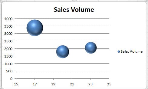
You cannot create a column chart or line chart with three data series in an Excel worksheet. Thus, the bubble chart can be your first choice.
The major difference of bubble chart is that the bubble itself also represents a set of data. Therefore, in such a chart, it actually contains three data series. And the following will introduce how to create such a chart.
Create a Bubble Chart
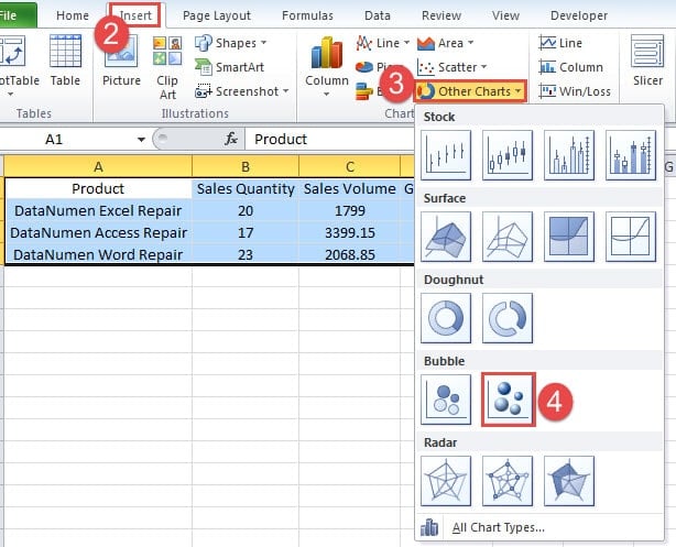
In this worksheet, there are three data series about the sales volume. And now you can create a bubble chart for this worksheet.
- Select the target area.
- Click the tab “Insert” in the ribbon.
- And then click the button “Other Charts”.
- In the drop-down menu, click option of bubble chart. If you want a better effect, you can also choose the one with 3-D effect.
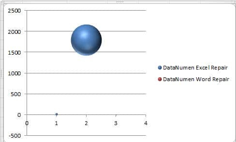
Now you will see a chart with only one bubble.
Therefore, further steps are required.
- After you create the chart, you will see the “Chart tool” options in the toolbar. And here click the button “Select Data”.
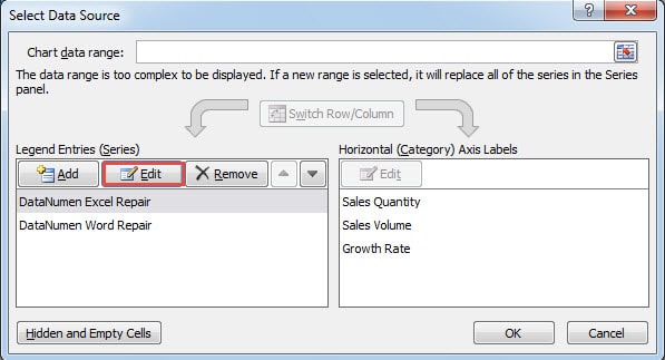
- Now in the “Select Data Source” window, click the button “Edit”.
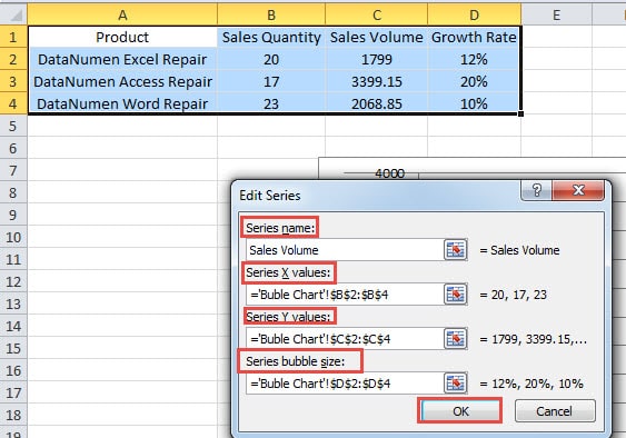
- And then input the corresponding contents into the text boxes in the “Edit Series” window. For the series name, you can direct input a name into it. Or you can also choose in the worksheet. The values of axis and the bubble size are all related with the data in the worksheet. You can also switch them according to your need.
- After that, click “OK”.
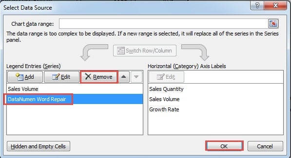
- Now you come back to the “Select Data Source” window. Here delete the series “DataNumen Word Repair”. In your worksheet, you need to delete according to the actual setting.
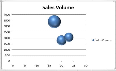
- And then click “OK”. Now in the chart, there are three bubbles.
Adjust Bubble Chart
In this bubble chart, the two bubbles connect together, which is not so clear. Therefore, you can also modify the chart.
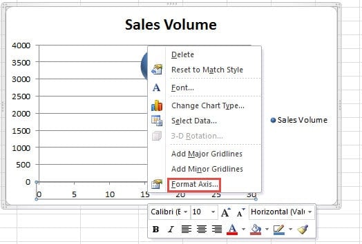
- Right click the X axis in the chart.
- In the menu, choose the option “Format Axis”.
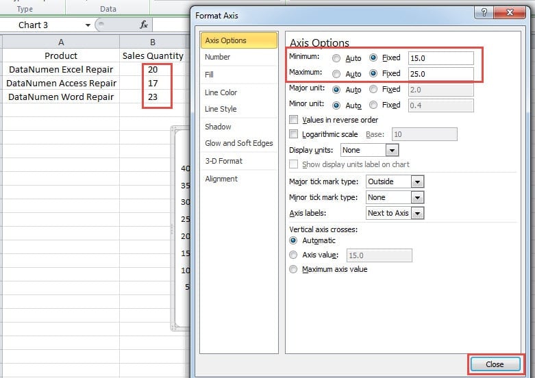
- In the “Format Axis” window, change the minimum and maximum number according to the “Sales Quantity” value. You can also make adjustment according to your actual data.
- And then close the window. And now you will find that the bubbles are all separate at their own places. This interface is much better that the former one.
Change the Bubble’s Color
The default color of each bubble is the same. If you want to make each bubble has the different color, you can also set manually.
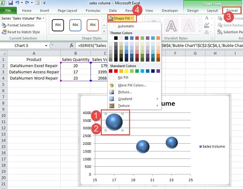
- Click the certain bubble that you want to change the color. Now you will see that actually all the bubbles in the chart are selected.
- Now click the chart again. Thus, only the target bubble is selected. And be careful that don’t double click the bubble. Otherwise the window of “Format Data Series” will pop up.
- Now click the “Format” tab in the ribbon under the “Chart Tools”.
- And then click the button “Shape Fill” in the toolbar.
- In the drop-down menu, choose a color for the bubble.
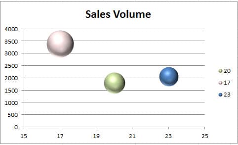
- And now repeat the steps and change color for other bubbles. In the image below, we have also change the color in the chart.
Identify Different Bubbles
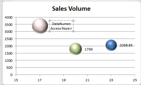
In the chart, even if you set the different color, you still don’t know which product is the corresponding data of the bubble. The legend in the chart only shows the sales quantity of each product. Thus, you need to add labels in the chart.
- Delete the legend in the chart.
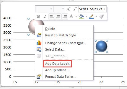
- Right click any of a bubble.
- And then choose the option “Add Data Labels”. Thus, the data labels will appear in the chart.
- Now click a label that you want to modify. Here all the labels will be selected.
- In this step, click the label again. Thus, only the target label will be selected.
- Now you can change the number into the product.
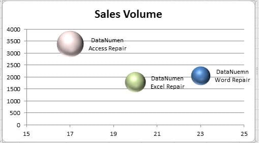
- Repeat the above steps and change all the other labels in the chart.
After all the steps below, now you have created a perfect bubble chart. And you will not be confused about the corresponding products.
Bubble Chart is Hard to Survive in an Excel Crash
Excel crash can happen at any time. As a result, almost all the data and information in Excel will be damaged, including those charts and tables. At this time, we recommend that you can use our potent repair tool to recover Excel. With this tool at hand, you are able to get back all the elements in a damaged Excel file.
Author Introduction:
Anna Ma is a data recovery expert in DataNumen, Inc., which is the world leader in data recovery technologies, including word recovery and outlook repair software products. For more information visit www.datanumen.com

