You will certainly use the bar chart to analyze important values. And now we will demonstrate the creation of a bi-direction chart in Excel.
There are many methods about charts in Excel. Now if you want to compare the values in cells, you can also realize it in a bi-direction chart. In the image below, you can see that there are values about two different sales representatives.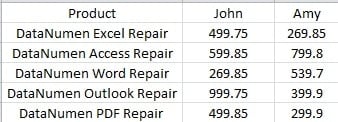
Now you can insert such a chart and compare their sales volume.
Insert a Bi-direction Chart
Here are the steps to create the chart.
- Select the target area in worksheets.
- And then click the tab “Insert” in the ribbon.
- Click the button “Bar” in the “Charts” area.
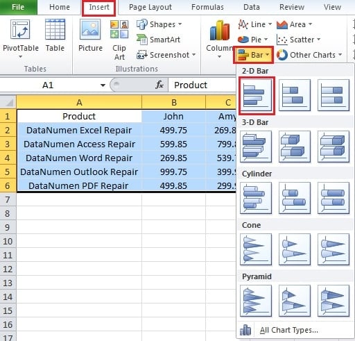
- And then in the drop-down menu, click the option “Clustered Bar”. Thus, you have created the chart in Excel.
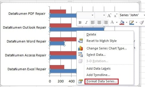
- Right click any of a bar in the chart.
- And then in the menu, choose the option “Format Data Series”.
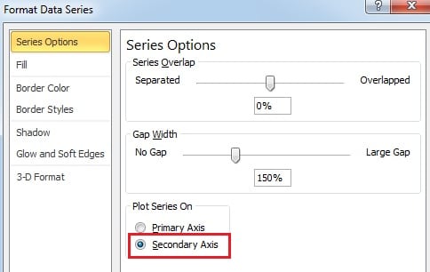
- In the new pop-up window, check the option “Secondary Axis”.
- And then close the window.
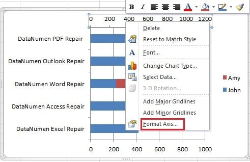
- Now right click the secondary axis in the chart.
- And click the option “Format Axis”.
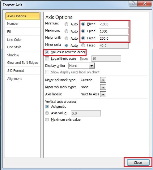
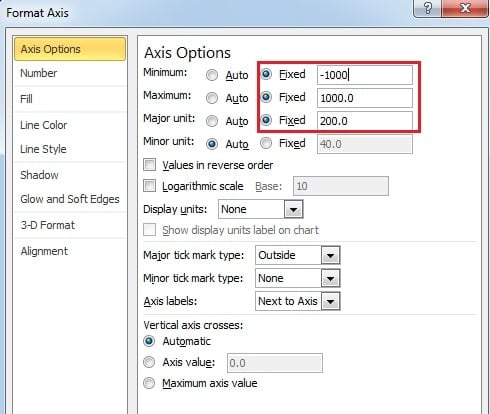
- After that, set the axis options. Change the options to “Fixed” and modify the value. You may change the value according to the actual data. And don’t forget to check the option “Values in reverse order”.
- And then close the window.
- Now continue click the first axis in the chart.
- And also click “Format Axis” option.
- Here in this window, set the same value of axis options. Here uncheck the “Values in reverse order”. In fact, in the two axis options, you only need to check this option once. Therefore, if you forget to check the option in the step 11, you can still check here.
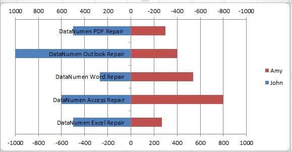
- Now you can close the window. Now you can see that the bi-direction chart appear in the worksheet.
To make the appearance better, you can still make some adjustments.
- Right click the vertical axis.
- And in the menu, choose “Format Axis”.
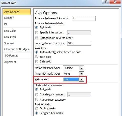
- In the “Format Axis” window, change the position of the “Axis Label”.
- Close the window.
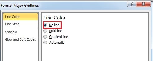
If you want to delete the gridline in the chart, you can double click any of the line in the chart. In the “Line Color” tab, choose the option “No Line”.
Hence, you will create an excellent bi-direction chart in your worksheet
Charts are also the Victim in a Data Disaster
Once you have created the chart in Excel, you will certainly want to keep it in a good condition. Therefore, you can invest a third party tool at hand. Once data disaster happens, you can use it to fix Excel immediately. The earlier you take action, the less you will lose.
Author Introduction:
Anna Ma is a data recovery expert in DataNumen, Inc., which is the world leader in data recovery technologies, including word recovery and outlook repair software products. For more information visit www.datanumen.com
