Chart in Excel are always used to analyze some important information. Therefore, in this article we will demonstrate how to add horizontal average line to vertical chart in Excel.
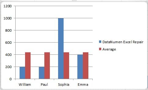
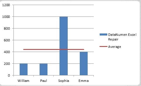
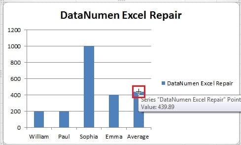
In an Excel worksheet, you will always add a chart according to the data in certain cells. And sometimes, you will need to know the average level of certain index. For example, in this image, you can see that there is a bar chart for the sales volume of those sales representatives.
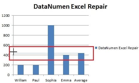
However, the average level is hard to see from this chart. Thus, you need to add an average line into this chart. And the following are the two ways to add.
Add Horizontal Average Line to Vertical Chart
The following are the steps to add a horizontal average line.
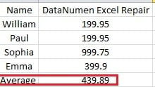
- In the original worksheet, add a column of average sales volume.
And you can use the Average function to calculate the number.
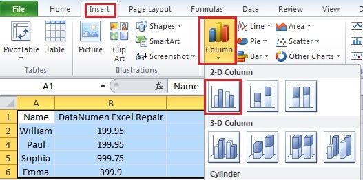
- Select the whole area including the average column.
- Click the “Insert” tab in the ribbon.
- And then click the “Column”.
- Now in the drop down menu, click the clustered column to create a bar chart. Thus, you have created a new chart.
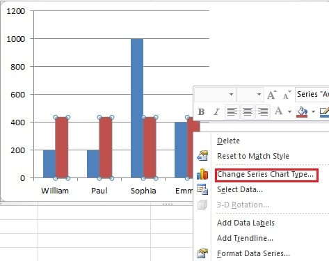
- Right click any of the red bars in the column.
- In the new menu, choose the “Change Series Chart Type”.
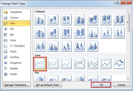
- And then in the “Change Chart Type”, choose the line chart.
- Next click “OK”. Therefore, you have finished all the setting, and you can see that in the bar chart, there is an average line.
Add Horizontal Line through Inserting Line Feature
This is the other method to add an average line.
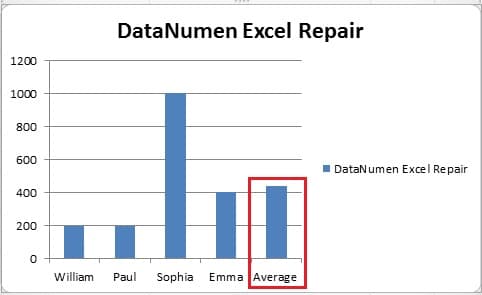
- In the original worksheet, add a row of average sales volume.
- Select the whole area.
- Repeat the step3-step5 in the previous part to create a bar chart.
- Click the chart to position the cursor on the chart. If you skip this step, the line will not in the chart.
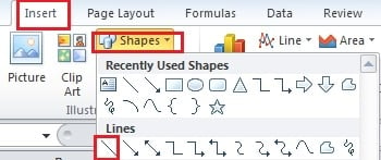
- Click the “Insert” tab in the ribbon.
- And then click the “Shapes”.
- In the drop-down menu, choose the “Line”.
- Then hold the key “Shift” on the keyboard.
- In this step, you should be more careful. Put your cursor on the top of the bar “Average”.
- Then use your mouse to drag and draw a line in the chart. Because now you are holding the “Shift”, you don’t need to worry about the line will not be horizontal.
Thus, the average line will be created. And if you want to change the color or the type to make it clearer, you can also set in the ribbon.
The above are the two ways to add horizontal line into a vertical chart. In addition, in the next article, we will introduce about adding a vertical line into the horizontal bar chart.
Author Introduction:
Anna Ma is a data recovery expert in DataNumen, Inc., which is the world leader in data recovery technologies, including word recovery and outlook repair software products. For more information visit www.datanumen.com

