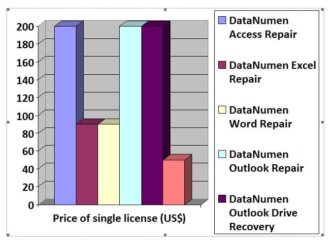
In this article, we will present you 2 methods to present your table data in a chart in Word.
Reasons to Present Table Data in a Chart
First of all, let’s take a look at why you may need to display table data in a chart in your Word document. Generally, the reasons go as below:
- A chart is more intuitive than a table on Word file. There is no doubt that charts can help readers easily understand data and connections among them.
- It’s convenient. Whenever you need a chart for your file, you don’t have to create one. Instead, all you need to do is get a table and implement our steps which we will offer in the following text.
- Get rid of complicated Excel work. With the following 2 methods, you can avoid Excel operations given to the fact that some users are not so familiar with Excel.
Method 1: Insert a Chart with Data from the Table
- First and foremost, click the cross sign on the upper-left corner of the table so as to select it. For example, we here has table as below:

- Then press “Ctrl+ X” to put the table on “Clipboard”.
- Next click “Insert” tab.
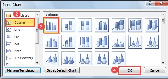
- And click “Chart” in “Illustrations” group to open the “Insert Chart” dialog box.
- Now you choose a chart type first.
- Then go to choose a style.
- And click “OK”.
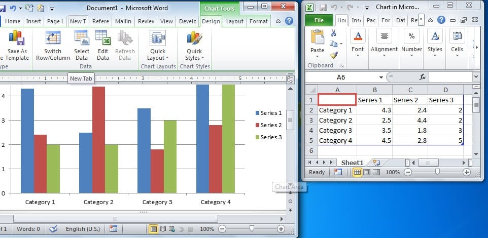
- Now there is a chart with the style you just choose on Word file. And there is also an Excel sheet. On the Excel sheet, there is a table with blue borders as its range. Click the A1 cell.
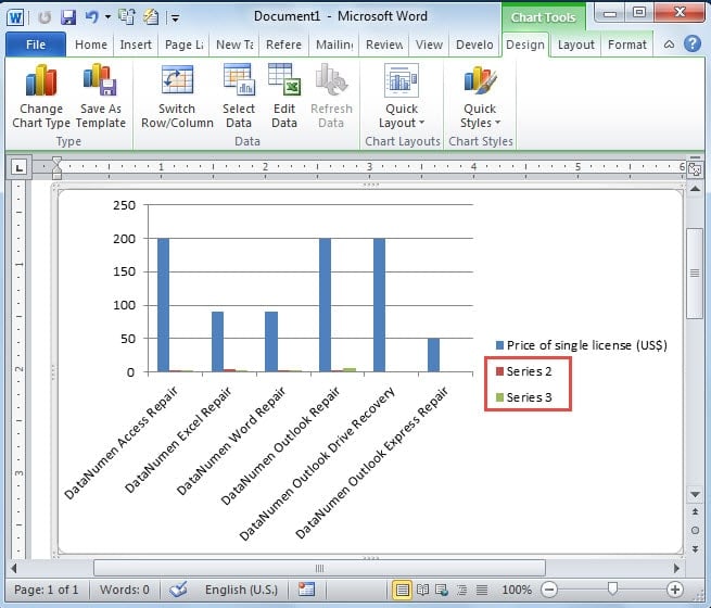
- Press “Ctrl+ V” to paste the table from Word to Excel sheet. You can see the chart on Word file now changes. Yet there are still default settings left, such as the column names, series 2 and series 3, which we certainly don’t need.
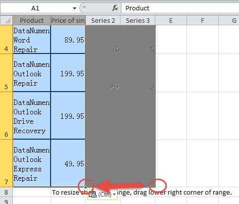
- So next you drag the lower corner of the blue range to make it coincide with the table just copied.
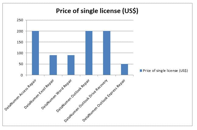
Now the chart has turned into the one you need.
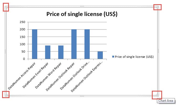
- Finally, click and drag the four square corners of the chart to adjust its size properly.
Method 2: Insert a “Microsoft Graph Chart”
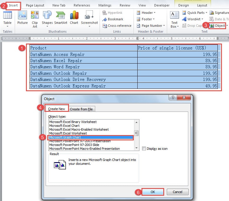
- To begin with, select the table with the way in method 1.
- Then click “Insert” tab, too.
- Next go to click “Object” in “Text” group.
- Then click “Create New” in “Object” dialog box.
- And choose “Microsoft graph Chart” from “Object type”.
- Then click “OK” button.
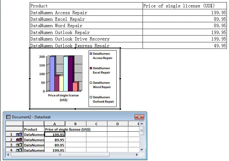
- Now there will be a table, a chart, and a datasheet on the Word file. You can delete the original table and close the datasheet.
- Lastly, click and drag handles around chart to adjust its size.
Word Corruption: A Nightmare
Word is such an amazing tool that most of us rely on it so much to conduct daily office work. It is because of the same reason that we should always look out the Word stability. One way suggesting here to reduce the downtime once your Word shut down suddenly is to get a third-party corrupt doc fix tool beforehand.
Author Introduction:
Vera Chen is a data recovery expert in DataNumen, Inc., which is the world leader in data recovery technologies, including Excel xls file repair and pdf repair software products. For more information visit www.datanumen.com

