When there are many data series in a worksheet, the corresponding line chart will also be in a mess. In order to make the chart clearer, we have the two methods in this article.
The line chart in Excel can show data and information better. But with many lines in one chart, you will find it hard to check certain lines. In our previous article How to Create a Dynamic Line Chart with Checkboxes in Your Excel Worksheet, we have introduced a method to make the line chart better. And here we have found other two effective methods. Continue reading this article and see how these two methods take effect.
Method 1: Create a Pivot Chart
The pivot chart in Excel is very powerful. You can use it to fulfill many amazing tasks. And here we will show you the steps of using pivot chart to make the line chart better.
- Select the original range in the worksheet.
- And then click the tab “Insert” in the ribbon.
- After that, click the arrow button under the button “PivotTable”.
- In the drop-down menu, only two options are available. Here you need to choose the second option “PivotChart”.

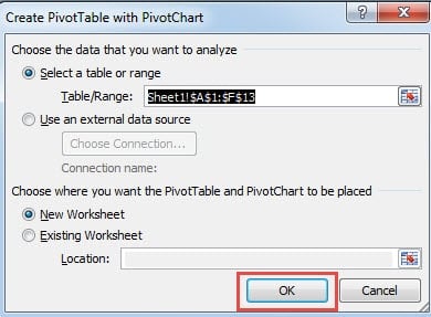
- After that, in the “Create PivotTable with PivotChart” window, set the location that you need to show the chart. Here we will choose a new worksheet.
- When you finish the setting of location, click the button “OK” in the window. Next you will directly come to the new worksheet with the pivot table and the pivot chart.
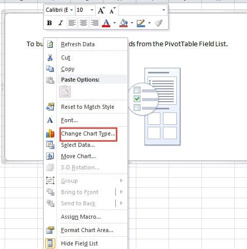
- In this worksheet, right click in the chart area.
- And then in the new menu, choose the option “Change Chart Type”.
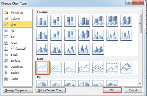
- In the “Change Chart Type” window, you can see that the default chart type is column chart. Here you need to choose the line chart in this window.
- After that, click the button “OK” in the window.
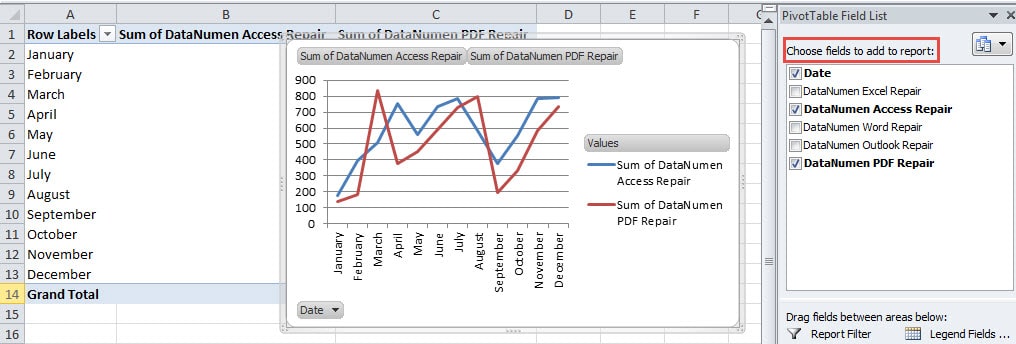
- Now you will also come back to the worksheet. Here you can check the fields in the “Choose fields to add report” area. The field “Date” needs to be always checked. As for other products, you can check them according to your actual need.
Therefore, you can see that using the pivot chart can save you a lot of time and energy. Therefore, the next time you can consider using this method.
Method 2: Use VBA Macros
If you don’t want to create another worksheet or a new pivot table in your worksheet, you can use the VBA macros in the file. Also here you need to combine the VBA macros with the check boxes for the line chart. Before you use the macros, you need first arrange the worksheet.
- In the original worksheet, create the line chart for the data and information.
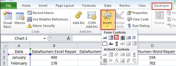
- And then click the tab “Developer” in the ribbon. If there is no such a tab, you need to add it in the “Excel Options” window.
- Next click the button “Insert” in the toolbar.
- After that, choose the “Check Box” in the drop-down menu.
- And then click in the chart area. Therefore, you have inserted a new check box in the worksheet.
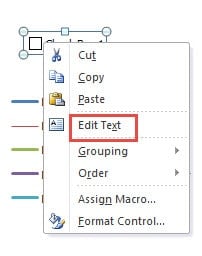
- Next right click the check box.
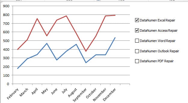
- In the pop-up menu, change the text into the name of the product “DataNumen Excel Repair”.
- Next adjust the width of the check box so that it can show the whole phrase.
- Repeat the step 2-8 and insert other check boxes for other products. You need to insert the number of check boxes and change their names according to your need.
- Ans then in this step, press the button “Ctrl” on the keyboard and hold it.
- Next use your mouse to select all the check boxes in the chart.
- After that, you can release the button “Ctrl”.
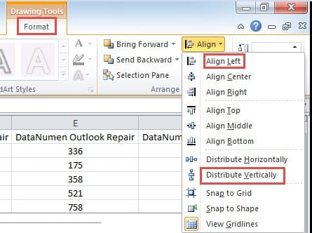
- And then click the tab “Format” in the ribbon.
- After that, click the button “Align” in the toolbar.
- In the drop-down list, choose the options and align those check boxes. Here we will choose “Align Left” and the “Distribute Vertically” in the menu.
- Next, press the “Ctrl” again.
- And then click the line chart. After that, you can also release the button.
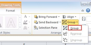
- After that, click the button “Group” in the toolbar.
- In the drop-down list, still click “Group”. Therefore, you have grouped those check boxes with the line chart.
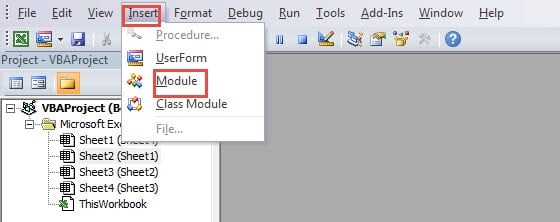
- When you finish the setting in the chart, you need to use VBA macros. Here press the button “Alt +F11” on the keyboard to open the Visual Basic window.
- And then insert a new module in the editor.
- In this step, copy the following codes into the new module.
Sub HideShowLine()
  Application.ScreenUpdating = False
  Dim i As Integer
  For i = 1 To 5
    If ActiveSheet.CheckBoxes("Check Box " & i).Value = -4146 Then
      ActiveSheet.ChartObjects("Chart 1").Activate
      ActiveChart.SeriesCollection(i).Format.Line.Visible = msoFalse
    Else
      ActiveSheet.ChartObjects("Chart 1").Activate
      ActiveChart.SeriesCollection(i).Format.Line.Visible = msoTrue
    End If
  Next i
End Sub

Sub AssignMacro()
  Application.ScreenUpdating = False
  Dim i As Integer
  For i = 1 To 5
    ActiveSheet.Shapes.Range(Array("Check Box " & i)).Select
    Selection.OnAction = "HideShowLine"
  Next i
End Sub
There are two macros. The first will hide or show lines according to the condition of the corresponding check boxes. And the second is to assign the first macro to those check boxes. You need to change certain elements in the codes, such as the numbers of the lines, and the name of the chart.
- And then you need to run the second macro. Click in the area of the second macro and press the button “F5” on the keyboard to run it.
Next you can come back to the worksheet. When you check or uncheck the check box, you will see the corresponding lines in the chart.
This method is also very useful. In your actual worksheet, you can also have a try.
A Comparison of the Methods
In this part, we will make a comprehensive comparison of the three methods. And the other method is in the article How to Create a Dynamic Line Chart with Checkboxes in Your Excel Worksheet.
|
Comparison |
Create a Pivot Chart | Use VBA Macros |
Use Check Boxes |
|
Advantages |
This method is very easy to use. And you don’t necessarily need to know the VBA or other functions. | The VBA codes can also be used in other worksheets. You only need to modify certain elements in the codes. | When you don’t know VBA macros and you want to show the result in this ordinary line chart, you can use this method. |
|
Disadvantages |
This method will create the pivot table together with the pivot chart. If you don’t want to create an additional pivot table, you can use other methods. | If you are not familiar with Excel VBA, you will probably meet with problems when changing or running the macros. | This method will actually add a new range in the worksheet. And this will mess up your worksheet. |
All the methods have their advantages and disadvantages. When you need to hide or show lines in a line chart, you can choose one method according to your actual need.
Focus on the Privacy and Security in Excel
In your Excel, not only will there be the data and information that you manually input, but also there will be some private information. This private information is essential. Therefore, you need to pay special attention to your files. Sometimes your files will be damaged by virus or the malicious malware. The result can be very series. Your personal information in the worksheet will be known by someone else. Besides, the data and information will also be damaged. At this moment, you can use a third-party tool to repair Excel xlsx file error. With this tool at hand, you can well protect your important files.
Author Introduction:
Anna Ma is a data recovery expert in DataNumen, Inc., which is the world leader in data recovery technologies, including repair Word docx problem and outlook repair software products. For more information visit www.datanumen.com
