Sometimes you need to display data in a column chart. In this article, we will show you 2 excellent ways to display data in a column chart that combines clustered and stacked column.
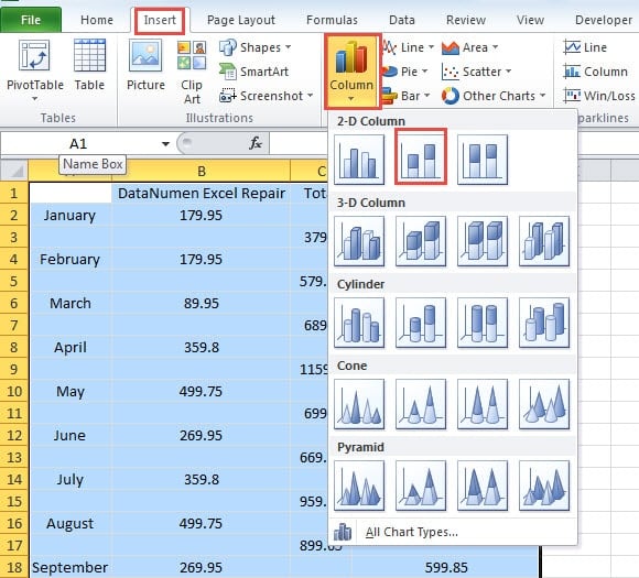
It is very easy for you to insert a clustered column or a stacked column. For example, in the image below, you can certainly choose one of the charts for the area.
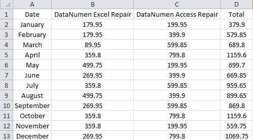
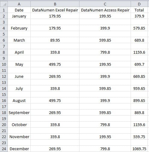
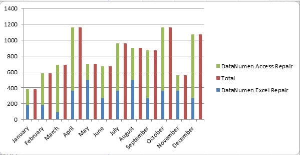
Suppose you need to show the proportions of the sales volume of the two products in one column chart. Thus, you need to combine these two different types of charts, you can make some additional settings. And now follow the steps below to create such a column chart.
Method 1: Add Legend Entries
In this method, you need to add additional legend entries in the column chart.
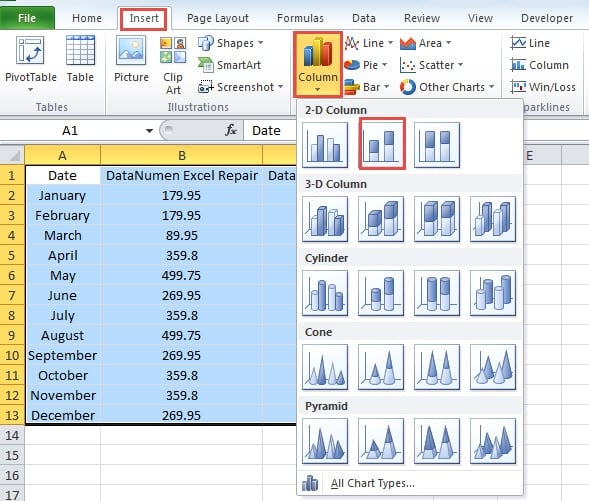
- Select the target area.
- Next click the tab “Insert” in the ribbon.
- After that, click the button “Column”.
- And then in the drop-down list, choose the “Clustered Column”.
Now you have inserted a clustered chart into the worksheet.
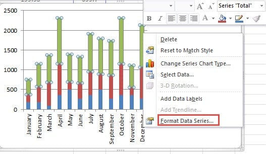
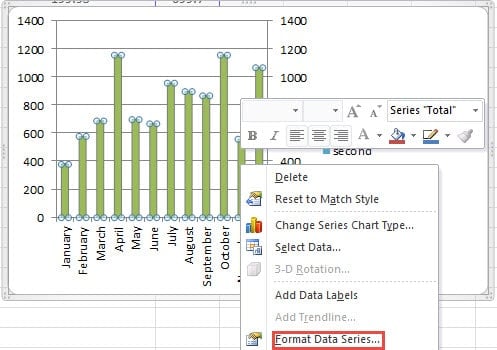
- Right click the column of the series that you need to put to another column.
- In the menu, choose the option “Format Data Series”.
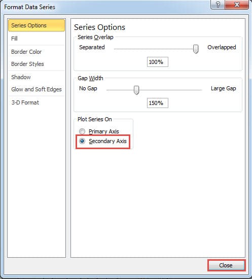
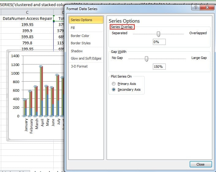
- In the “Format Data Series” window, choose the option “Secondary Axis” for this series.
- And then close the window.
- After that, right click the chart.
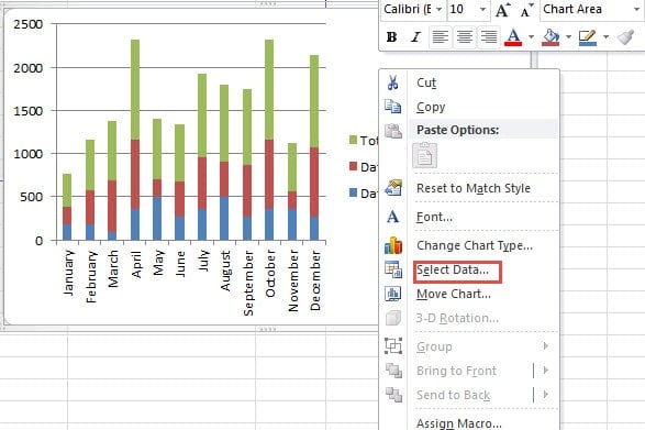
- And then choose the option “Select Data” in the menu.
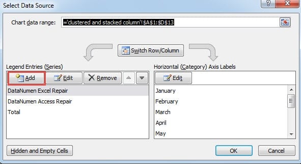
- In the “Select Data Source” window, click the button “Add” in the “Legend Entries”.
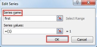
- And then in the “Edit Series” window, input a series name into the textbox. Here we input the word “first”.
- Now click “OK”.
- Repeat the step 11-13 and add the second series.
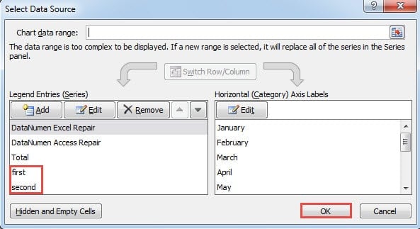
- After that, you can see that there are two new legend entries in the window. Click “OK” here.
- Now right click the column in the chart.
- Here click the option “Format Data Series” again.
- In the window, change the series overlap for the column. And you can see the effect immediately in the chart. You can adjust it according to the actual result. In addition, you can also change the gap width if you need.
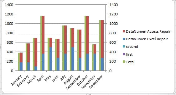
- When you finish the change, close the window. Now you can see the result in the chart. The clustered column and stacked column are both in the chart.
You can also delete the two legends in the label on the right to make the chart better.
Method 2: Rearrange the Target Range
Except for the above method, you can also use this method.
- Insert rows into every two adjacent rows in the range.
You can follow the method in our previous article to finish this task: How to Quickly Insert a Blank Row/Column into Every Two Adjacent Rows/Columns in Your Excel.
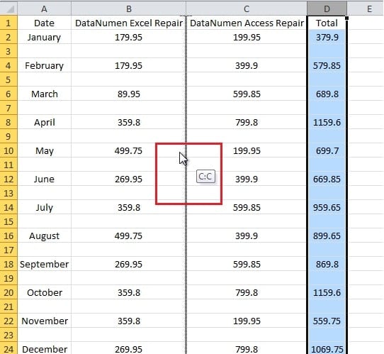
In this example, we want to put the “Total” as an independent column. Thus, the other two columns should be non-adjacent. So next we will switch columns. You can use the copy and paste to switch columns. But the steps below will be more convenient.
- Now select the column D in the worksheet.
- Press the button “Shift”.
- And then use your mouse to drag the column left to switch with column C. When you see this screen prompt, you can release the mouse and the “Shift” button.
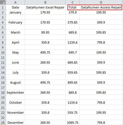
Thus, you have switched the two columns.
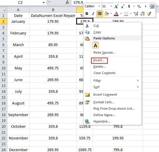
- Now right click the cell C2 in the range.
- In the menu, choose the option “Insert”.
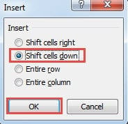
- In the “Insert” window, choose the option “Shift cells down”.
- And then click the button “OK”.
- Now clear the cell A1.
- After that, select the range.
- And then click the tab “Insert”.
- In the drop-down list, chick the “Stacked Column” again.
Thus, you can see the result in the new chart.
Using this method, the columns will not be tied together. Besides, you can also change the series overlap and the gap width according to your need.
An Analysis of the Two Methods
In the table below, we have compared the two methods in detail.
| Comparison | Add Legend Entries | Rearrange the Target Range |
| Advantage | 1. You don’t need to arrange the range in the worksheet.
2. In this method, the range will keep the original format. |
1. You don’t need to make additional settings on the legend entries, which make this method simpler.
2. In this method, you can also make additional adjustment through the chart feature according to your need. |
| Disadvantage | 1. Compared with the second method, there are more steps in this method.
2. Add legend entries and change the series overlap can be irritating because you need make sure that the chart will be in order. |
1. You have to rearrange the target range before you insert the stacked chart.
2. The worksheet will seem to be in a mess, which is not helpful if you need to refer to it. |
Invest an Excel Recovery Tool is a Necessity
For most of Excel users, preparing an Excel recovery tool is a necessity. There exist many virus and malware that can do harm to your Excel files. Besides, human errors, natural disastrous and other factors all have the possibility to happen. The result of those factors can be disastrous. You will lose all your precious data and information. Hence, invest an Excel recovery tool has becoming a necessity for every Excel user. Our Excel recovery tool is able to repair xls data and fix other errors that you meet. With this tool at hand, you will never need to worry about your files.
Author Introduction:
Anna Ma is a data recovery expert in DataNumen, Inc., which is the world leader in data recovery technologies, including repair doc data and outlook repair software products. For more information visit www.datanumen.com
