When you need to show the information in a chart according to the values, you can create a funnel chart. Hence, you can use the two methods in this article to create such a chart.
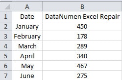
The information in a funnel chart can show the original data in a more intuitive way than the ordinary chart. Funnel chart can also reflect data and information in a clearly way. Therefore, in such a chart, you can know the relationship of different data and information clearly. The image below shows a range of sales volume of our product in the first half year. And now we will use this example to create a funnel chart for this range.
In newer version of Excel, you can create a funnel chart directly. This feature is indeed very convenient. But if you use older version of Excel, you need to make additional settings. That’s because there is no direct options of funnel chart. And now you can follow the two different methods in this article below to create a funnel chart. Here we will create a funnel chart by using Excel 2010. And the steps are very easy to learn.
Method 1: Use a Stacked Pyramid Chart
In this method, you need to first insert a stacked pyramid chart and then modify it.
- Select the target range in the worksheet.
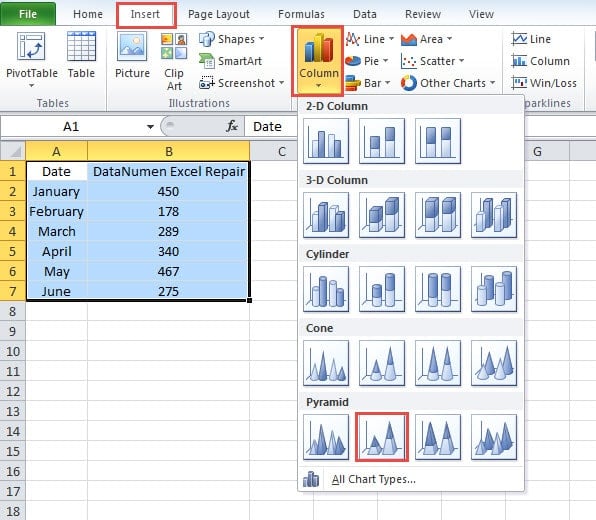
- And then click the tab “Insert” in the ribbon.
- Next click the button “Column” in the toolbar.
- In the drop-down menu, choose the “Stacked Pyramid”. Thus, the new chart will appear in the worksheet.
- When the chart appears, you will see the “Chart Tools” tab in the ribbon. And here click the button “Switch Row/Column” in the toolbar.
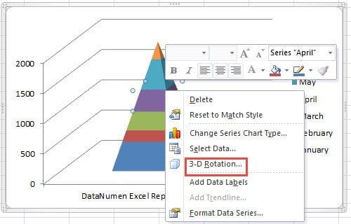
- Right click in the chart.
- In the new menu, choose the option “3-D Rotation”.
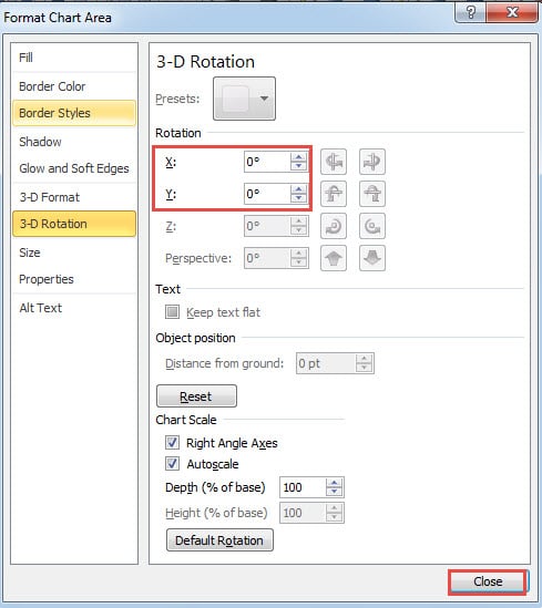
- In the new window, change the rotation of the X and Y into “0”.
- Next close this window.
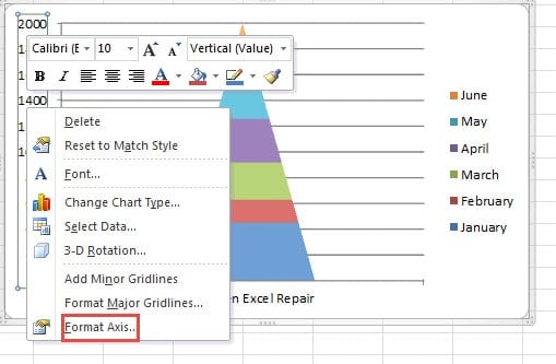
- And then right click the vertical axis.
- In the pop-up menu, choose “Format Axis”.
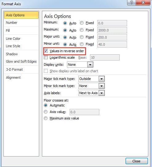
- In the “Format Axis” window, check the “Values in reverse order”.
- Next close this window. Now come back to the worksheet, you will see the effect.
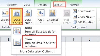
- After that, click “Layout” tab in the ribbon.
- And then click the button “Data Labels” in the toolbar.
- Next choose the option “Show” to add data labels for the chart.
- In this step, delete the gridline in this chart.
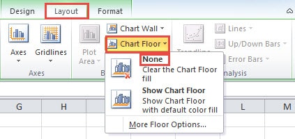
- And then click the tab “Layout”
- Here click the button “Chart Floor”.
- In the menu, choose the option “None” to delete the chart floor.
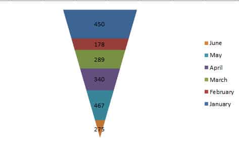
- And then delete the horizontal axis and vertical axis. Thus, your will get this funnel chart like the image below show.
Method 2: Insert Stacked Bar Chart
Except for the above method, you can also use the stacked bar chart in the worksheet. And here you need to filter the data and add another new column for the worksheet.
- Select a cell in the range.
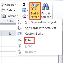
- And then click the button “Sort & Filter” in the toolbar.
- Next click the “Filter” in the drop-down menu.
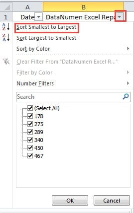
- Now click the button in the cell B1.
- And then click the option “Sort Smallest to Largest” in the menu.
- In C1, input the header of the new column. Here we input “Add the Additional Number” into it. You can add it according to your need.
- In cell C2, input the formula into it:
=($B$7-B2)/2
In this formula, we will get the additional number for each number. Thus, in the following steps, we can make sure that all the column of the sales volume series will have the same center line.
- And then press the button “Enter” on the keyboard.
- Next click the cell C2 again.
- In this step, double click the fill handle of this cell. Thus, you have filled this whole column.
- After that, select the whole range.
- Next click the tab “Insert” in the ribbon.
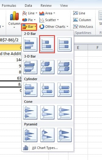
- Then click the button “Bar” in the ribbon.
- In the drop-down list, click the “Stacked Bar”.
- And then click the button “Select Data” in the toolbar.
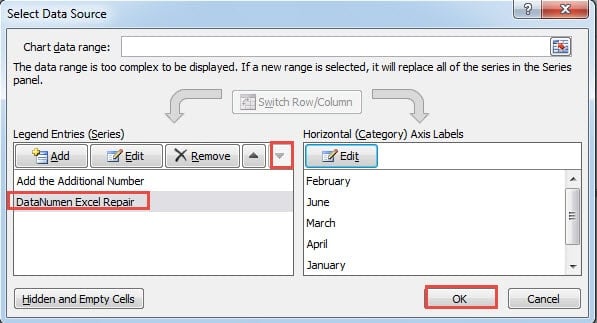
- In the “Select Data Source” window, change the order of the two legend entries.
- Next click “OK”.
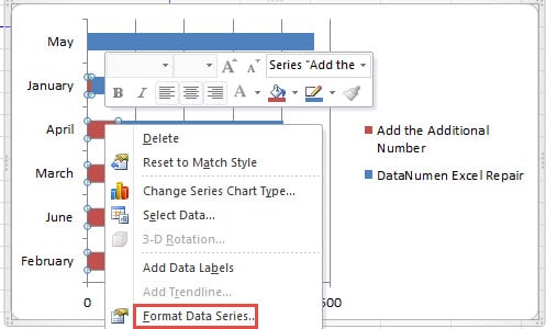
- In the chart, right click the series of the column that you have added.
- And then in the pop-up menu, choose the “Format Data Series”.
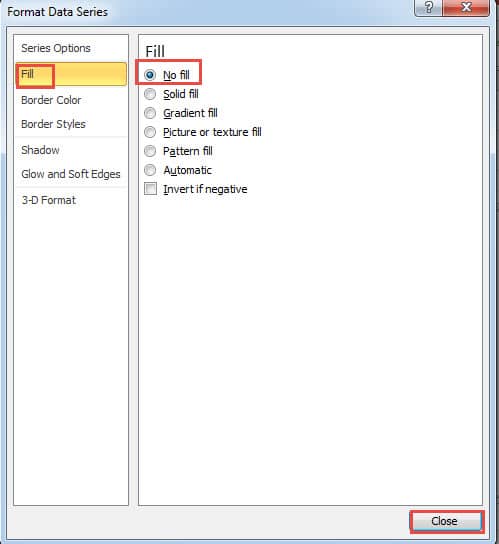
- In the “Format Data Series” window, click the option “Fill” on the right.
- And then click the option “No fill” on the right.
- Next close this window.
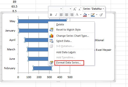
- Now you will come back to the worksheet again. Right click another data series in the chart.
- And then also choose the “Format Data Series” in the menu.
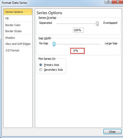
- In the new window, change the gap width into “0”.
- Next close this window.
- Now add the data label for this chart. Be careful that don’t add the data label for the other data series.
- And then delete the legend.
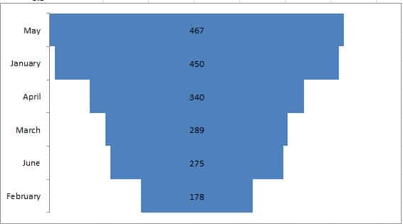
- After that, delete the horizontal axis and the gridline in this chart. Thus, you will get this new funnel chart in this worksheet.
You can also make additional settings according to your need to modify this funnel chart. And both of the two methods are very easy to manipulate.
The Comparison between the Two Methods
From the above analysis, you have learned the two different methods to create an intuitive funnel chart. But there still exist differences between these two methods. When you don’t know which method you can use, you can refer to the table below.
|
Comparison |
Use a Stacked Pyramid Chart |
Insert Stacked Bar Chart |
|
Advantages |
1. This method is easy to understand and manipulate.
2. There are fewer steps in this method. When you are in a hurry to make a funnel chart, you can use this method. |
1. The length of each bar represents the actual values in the worksheet.
2. The order in the funnel chart ranks according to the value. Thus, it will be much easier for you to analyze in such an intuitive chart. |
|
Disadvantages |
1. The sizes of columns in this chart don’t represent the actual value in the worksheet.
2. If you need to know the rank of those numbers, you will find it hard to see the data labels in the chart directly. Instead, you still need to refer to the original range. |
1. Compared with the first method, this method contains more steps. Thus, you are required to spend more time when using this method.
2. If you find it difficult to understand and use this method, you can only use the first methods. Thus, you cannot know the rank of different values. |
From this table, you must have a clear understanding about the two different methods. The next time when you need to create a funnel chart for your worksheet, you will know which methods you can use.
What’s the Importance of Backing up
Actually we all know the importance of backing up your essential files, especially the Excel files that contains data and information. However, the more important those files are, the greater chances there exist that they will be damaged by hackers or malicious malware. A mission of those accidents is that you need to repair your files. When you cannot get access to your files, you can consider a data disaster. In order to repair Excel xls data problem and get back all your data and information, you can use out powerful Excel recovery tool. This tool is equipped with the best technology in the world, and it can fix almost all the errors in Excel. Compared with other recovery tool, our software is indeed your first choice.
Author Introduction:
Anna Ma is a data recovery expert in DataNumen, Inc., which is the world leader in data recovery technologies, including repair Word docx corruption and outlook repair software products. For more information visit www.datanumen.com
